On Windows there aren't that many options for change the rendering of the text that is, the way in which it is seen and read on the screen. The only option available, besides the standard black and white, is the ClearType, a technology developed by Microsoft that sharpens the outlines of characters and improves the readability of text on the LCD monitor. Those who have no idea what I'm saying just look at the Wikipedia page with the figures regarding the Cleartype to understand what this article is about.
So let's see how to use Cleartype on Windows 10 for improve the readability of the text on the screen if it was blurry or blurry.
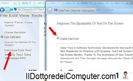
To set up Cleartype technology and improve the readability of the screen on Windows 10 just go to Control Panel> Appearance and Personalization> Fonts and click the link on the left "edit Cleartype text". At that point you must check the Activate Cleartype option and follow the configuration wizard by following the instructions on the screen and pressing Next. The procedure asks you to select the boxes where the text is best read. At the end, you get the optimization of the display of text and characters in Windows.
You can change, in another way, rendering fonts on the monitor in Windows, by downloading the tool for Windows, BetterClearType Tuner
This program was designed to optimize standard Windows rendering and to display clearly defined written text characters on any monitor.
With Better ClearType you can quickly configure the font smoothing settings in Windows 10 in an optimal way. You can then enable or disable font anti-aliasing, choose between grayscale anti-aliasing or subpixel anti-aliasing using RGB or BGR subpixel layouts (try which of the options works best, change the font rendering contrast (when using anti-aliasing subpixel RGB or BGR) and preview the results with different font sizes to better understand what changes.
An alternative and similar program that also works in Windows 10 is Mactype, which changes the rendering of fonts on the PC screen using Mac style or other rendering types. The program can be installed in English and can be started automatically when the PC is started. From the main menu of the program it is possible to choose the rendering mode and do the tests to see how the display of characters in the menus and on the texts of the programs changes. Mactyp can be installed as a service which is the recommended mode and ensures the best compatibility with the rendering system. If you install it as a service, the program consumes a negligible amount of memory and can be activated and deactivated by going to the Start> Run menu and typing services.msc.
Everything seems to be clear, legible and without graphics problems:
- Vertical text in programs like PowerPoint are rendered correctly and there is no glitch about the colors in the PowerPoint presentation.
- Subtitles in various media players (SPlayer, KMPlayer ...) are rendered smoothly.
- The window titles, even with the Aero effect active, can be seen correctly.
Someone may notice a flicker when opening documents written in black on white such as Word, in this case it is better to delete Gdipp and wait for a more stable version.
In another article we have then seen other solutions in case you see blurry text in Windows, Chrome, or other programs.
Improves the display of text and fonts: ClearType